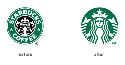
Ahhh, Starbucks. My friend. I always look for you, practically every day. You are easy to find while driving in an unfamiliar strip mall parking lot. You are easy to spot in a busy shopping mall. You are a street corner beacon of hope for the afternoon yawns. Your green and black round logo says “trustworthy”, “stamped with approval”, “high quality”, “special treat”, “friendly”, and “knowledgeable about coffee”. Until now.
Behold the new Starbucks logo:
 Although it has not been released yet, the new Starbucks logo is causing a stir. And not the sweet, pour some sugar in your coffee kind of stir. More of a circling the drain type of stir. My question is, when did Starbucks decide to become a seafood restaurant? Or when did they decide to sell environmentally friendly cleaning supplies made from fresh sea water by a mermaid in Finland? Really, Starbucks? Not so warm and fuzzy here. Sometimes more is more and that is okay.
You see, I usually love the minimalist logo. There are plenty of examples of logos that are able to stand on their own sans type without loosing integrity and the companies actually benefited from it such as the Nike swoosh, and McDonald’s famous golden arches M. The Starbucks logo without type feels like something is missing. I feel like I have lost a dear friend. Or I feel like my best friend in second grade moved away to Ohio with no forwarding address. Sorry Starbucks, I am now BFFs with my trusted peanut butter and jelly sandwich.
If Starbucks is in fact planning to expand to exotic food sales and cleaning supplies, then great. I am fine with that. I am capable of looking back at the old Starbucks in a nostalgic way (whatever I tell myself). Most importantly, is all of this this going to effect the purchasing of my usual tall skinny vanilla latte? No way! I mean, I am not totally stupid 🙂
What do you all think about this new logo?
