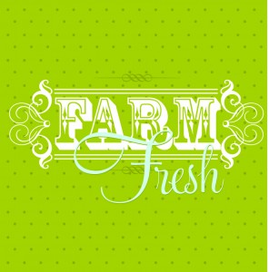
 I have kind of an unhealthy addiction to type. Typefaces are like crack to me (without all the obvious wrong). I love the shapes, curves, and corners. I love the negative space around letters and numbers. I think there are some of you typophiles out there that agree with me. I also love type that is just for fun. Because all work and no play can make type suck really bad.
I can sum it up here:
“There are essentially two kinds of typography: The familiar kind for reading, and the other, simply for viewing, like a painting. Some say that readability is most important. There are really two important things about typography: readability and beauty; both are equally important.” -Paul Rand
We have been inspired by the beauty of the fonts at Letterhead Fonts. These fonts don’t just include type in the traditional sense. Some collections include nostalgic themes, banners and borders. Combine them with bright colors and you have a fresh new take on the classic. Just for fun.
