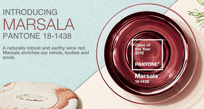
Every year Pantone chooses it’s color of the year. This year the color Marsala was chosen. Here is how Pantone describes Marsala, “Much like the fortified wine that gives Marsala its name, this tasteful hue embodies the satisfying richness of a fulfilling meal while its grounding red-brown roots emanate a sophisticated, natural earthiness. This hearty, yet stylish tone is universally appealing and translates easily to fashion, beauty, industrial design, home furnishings and interiors.” I’m not sure about all of that but I do know that it is a major transition from the colors over the past few years which were brighter, happier colors. Are we seeing a trend back towards earthier colors over the next few years? Is Avocado Green next? 🙂
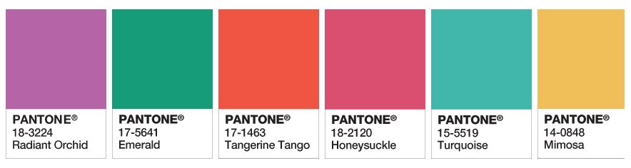
Previous Pantone Colors 2014-2009
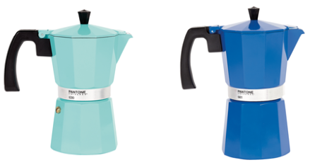
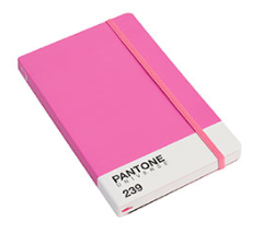
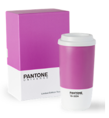
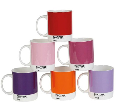
Pantone also has some really fun gifts that any designer on your list will drool over! Check them out here.